
Connecting Students with their interests and employers with future talents
Example Interactions

Home Screen (Light Mode)

Home Screen (Dark Mode)
Interact Through TouchScreen Click, provinding users with constant navigation wherever they are and whatever processes they are currently in.
———————————————————->

Menu (Light Mode)

Menu (Dark Mode)

Background & Development
Mission Statement:
Provide UW students (and other college students later) an interactive, user friendly, platform to connect with providers of experiential learning opportunities so that they can jumpstart their careers, research, and more.
Increase transparency and effiency in early stage talent acquisitions and career opportunities.
Sustain operating cost through targeted monetization of user data.

Background + Rationale:
As a student at University of Washington myself, I have come to understand, emphasize, and appreciate the increasing difficulty of students securing early stage career starts and how difficult firms have been in recuriting appropriate talents for their needs in an increasingly complex environment. ConnecT was born out of this situation, aiming to be the bridge between the gap of employers and future employees.

Competitive Design Analysis
Major Competitors:
Glassdoor, Handshake, LinkedIn, Indeed, National Research Laboratory, and many other more smaller platforms similar to those listed.
Competitor Inefficency:
Lack of an all-included, comprehensive application
Lack of transparent process, reviews, rating inputs
Overgeneralization and broad range of audience rather than targeting a niche
Why ConnecT?
Solves these shortcomings by taking user centered, proven design elements from each individual apps, while avoiding ineffective design choices.
Provide an all-in-one experience for applicants applying to different roles, understanding the company culture, interview processes, etc all through our single app.
Process:
As a result of deep and close collaborations with a few other UX designers working in the same project space, the persona exemplifies the unique characteristics of our possible users and highlights the services they might potentially desire.
Major Summaries:
Young Adolescent, current college Student
Trapped in an emotional state of loss, unsure, uncertainty, flooded with feelings of being overwhelmed.
Hardworking, motivated, and passionate about work/reserach in their respective field.
Personas
Provisional:


Final Example:
We have chose to utilize randomized semi-structured interview method to collect data for our user research.
Working with a few other UX researchers and designers, we have chose to break down each interview session into four major categories, from getting acclimated to our interviewees to then asking sharp questions regarding their thoughts and experiences with finding necessary resources.
The Questions are focused on deriving what features are considered core and necessary from users, and aggregate data for development of much needed functionalities.
User Research:


Results:
Based on a specifically curated set of questions we created earlier, we began to investigate what are the needs of students looking to finding resources on campus through randomized interviews with students, we then compiled our data and results together.
Our findings indicate that top priorities include:
Up to date, relevant information regarding experiential opportunities.
Available through technology mediums and applications.
Easy access and navigation, simple and human centered interaction experience.
Familarity with using basic technologies regarding mobile web applications on smartphones and computers/laptops.


User Journey Map
Our User Journey Map is used to document and visualize the process and steps a user to take to achieve their goal.
We combined our persona with our design goal and quesion, and throughout this process, we aimed to track not only how our user is thining or doing, but also how is she feeling, her pain points, and her emotional states.
A successful product not only let its users achieve their goals, but also aims to ensure that the process is smooth, easy, and not stressful.

Functionality Frames
Listing Page


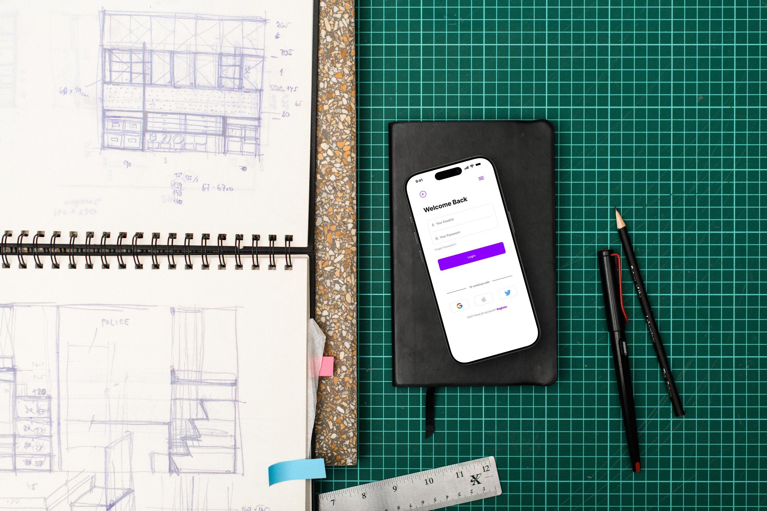
Login page
Applications Page


Application Page
Listing Page

PROTOTYPE EVALUATION
Findings:
Overall findings were quite positive, with no major flaws or redesigns seemingly needed, for now at this stage at least. Here are some summaries from this investigation:
Lack of adequate numerical qualities of participants
Lack of time, need more time to support some of the findings or to prove more refutations.
Minor improvements on some UI design and placement.
Positive Findings:
Easy to navigate interface
Fast task / function completion time
Duo coloring mode (Day/Night).
Accessible and transparency surrounding job listings
Negative Findings:
Difficulty for first-time user to accurately locate signup / login functionalities through user interface
Some dropdowns seemed unecessary and redundant, taking over too much screen areas
Lack of enough evaluation participants, need more research data to come to terms with a full and accurate picture.

